After reviews and comparisons, guides complete the core content types for a content site.
A guide is instructional. The reader arrives with a task to accomplish — deploy a site, set up a tool, configure something. They need to know upfront: how hard is this? How long will it take? What do I need before I start?
Guides answer those questions before the first step. That’s what makes them different from blog posts.
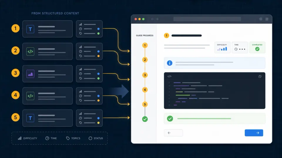
In Astro, this means a schema with fields that capture difficulty and time, a layout that surfaces those fields prominently, and content structured around clear steps.
What makes a guide different from a blog post
A blog post tells a story or shares an opinion. A guide solves a problem.
The difference shows up in the data:
Blog post schema:
title, description, publishedAtGuide schema:
title, description, difficulty, estimatedTime, publishedAtTwo extra fields, but they change everything about how the content is consumed. A reader scanning a list of guides uses difficulty and time to decide whether to click — before reading a single word of the content.
That decision-making data belongs in the schema, not buried in the first paragraph.
Step 1: Add the guides collection
Open src/content.config.ts and add:
import { defineCollection, z } from 'astro:content'
import { glob } from 'astro/loaders'

const posts = defineCollection({
  loader: glob({ pattern: '**/*.{md,mdx}', base: './src/content/posts' }),
  schema: z.object({
    title: z.string(),
    description: z.string(),
    publishedAt: z.date(),
  }),
})

const reviews = defineCollection({
  loader: glob({ pattern: '**/*.{md,mdx}', base: './src/content/reviews' }),
  schema: z.object({
    title: z.string(),
    description: z.string(),
    productName: z.string(),
    rating: z.number(),
    pros: z.array(z.string()),
    cons: z.array(z.string()),
    verdict: z.string(),
    publishedAt: z.date(),
  }),
})

const compares = defineCollection({
  loader: glob({ pattern: '**/*.{md,mdx}', base: './src/content/compares' }),
  schema: z.object({
    title: z.string(),
    description: z.string(),
    itemA: z.string(),
    itemB: z.string(),
    winner: z.string(),
    verdict: z.string(),
    publishedAt: z.date(),
  }),
})

const guides = defineCollection({
  loader: glob({ pattern: '**/*.{md,mdx}', base: './src/content/guides' }),
  schema: z.object({
    title: z.string(),
    description: z.string(),
    difficulty: z.enum(['beginner', 'intermediate', 'advanced']),
    estimatedTime: z.string(),
    publishedAt: z.date(),
  }),
})

export const collections = {
  posts,
  reviews,
  compares,
  guides,
}
The difficulty field uses z.enum — it only accepts exactly 'beginner', 'intermediate', or 'advanced'. Write 'easy' or 'hard' in a frontmatter file and Astro throws an error at build time.
This matters because the difficulty value drives the badge color in the template. If any value is accepted, you’d need to handle unknown values in the CSS. z.enum eliminates that problem entirely.
Step 2: Create the content folder and first guide
mkdir src/content/guides
touch src/content/guides/how-to-deploy-astro.md
Open src/content/guides/how-to-deploy-astro.md:
---
title: How to Deploy Astro to Vercel
description: Step by step guide to deploying your Astro site to Vercel — from GitHub repo to live URL in under 5 minutes.
difficulty: beginner
estimatedTime: 15 minutes
publishedAt: 2026-06-17T00:00:00Z
---

## How to Deploy Astro to Vercel

Vercel is the easiest way to get an Astro site live. It connects to your GitHub repo, builds automatically on every push, and gives you a live URL on the free tier.

## Prerequisites

- An Astro project pushed to GitHub
- A free Vercel account

## Step 1: Sign up for Vercel

Go to vercel.com and sign up with your GitHub account.

Using GitHub to sign in lets Vercel access your repos directly without extra configuration.

## Step 2: Import your repo

From the Vercel dashboard, click **Add New Project**. Find your repo and click **Import**.

Vercel detects Astro automatically — build command, output directory, everything.

## Step 3: Deploy

Click **Deploy**. Vercel runs the build and uploads to their CDN. First deploy takes about 30-60 seconds.

When it finishes, you get a live URL like `astro-content-lab.vercel.app`.

## Auto-deploy from now on

Every `git push` to your main branch triggers a new deploy automatically.

```bash
git add .
git commit -m "update content"
git push
# Vercel builds and deploys — no manual steps
No FTP. No SSH. No control panel. Push code, site updates.
---

## Step 3: Create the guides listing page

Create `src/pages/guides.astro`:

```astro
---
import { getCollection } from 'astro:content'
import BaseLayout from '../layouts/BaseLayout.astro'

const guides = await getCollection('guides')
---

<BaseLayout title="Guides — Astro Content Lab">
  <div class="page-header">
    <h1>Guides</h1>
    <p>Step-by-step guides for building with Astro.</p>
  </div>
  <div class="post-list">
    {guides.map((guide) => (
      <a href={`/guides/${guide.id}`} class="post-item">
        <div class="post-item-content">
          <span class={`badge badge-${guide.data.difficulty}`}>
            {guide.data.difficulty}
          </span>
          <h2>{guide.data.title}</h2>
          <p>{guide.data.description}</p>
          <p class="meta">⏱ {guide.data.estimatedTime}</p>
        </div>
        <span class="post-item-link">Read guide →</span>
      </a>
    ))}
  </div>
</BaseLayout>

<style>
  .page-header {
    margin-bottom: 2.5rem;
    padding-bottom: 1.5rem;
    border-bottom: 1px solid var(--color-border);
  }

  .page-header h1 { margin-bottom: 0.5rem; }
  .page-header p { color: var(--color-text-muted); margin: 0; }

  .post-list {
    display: flex;
    flex-direction: column;
    gap: 1rem;
  }

  .post-item {
    display: flex;
    align-items: center;
    justify-content: space-between;
    padding: 1.25rem 1.5rem;
    border: 1px solid var(--color-border);
    border-radius: var(--radius);
    text-decoration: none;
    color: var(--color-text);
    transition: all 0.2s;
    gap: 1rem;
  }

  .post-item:hover {
    border-color: var(--color-primary);
    box-shadow: var(--shadow-sm);
    text-decoration: none;
  }

  .post-item-content h2 {
    font-size: 1.0625rem;
    margin: 0.35rem 0;
  }

  .post-item-content p {
    font-size: 0.875rem;
    color: var(--color-text-muted);
    margin: 0;
  }

  .post-item-link {
    font-size: 0.875rem;
    color: var(--color-primary);
    font-weight: 500;
    white-space: nowrap;
    flex-shrink: 0;
  }

  .badge {
    display: inline-block;
    font-size: 0.75rem;
    font-weight: 600;
    padding: 0.2rem 0.6rem;
    border-radius: 999px;
    text-transform: capitalize;
    margin-bottom: 0.35rem;
  }

  .badge-beginner    { background: #dcfce7; color: #15803d; }
  .badge-intermediate { background: #fef9c3; color: #854d0e; }
  .badge-advanced    { background: #fee2e2; color: #b91c1c; }

  .meta { margin-top: 0.35rem !important; }

  @media (max-width: 640px) {
    .post-item { flex-direction: column; align-items: flex-start; }
  }
</style>
The difficulty badge uses a dynamic class: badge badge-${guide.data.difficulty}. Because difficulty is validated by z.enum, it can only be beginner, intermediate, or advanced. The CSS has rules for exactly those three values.
No conditional logic needed in the template. No runtime errors from unexpected values. The schema does the work.
Step 4: Create the guide detail page
Create src/pages/guides/[slug].astro via VS Code:
---
import { getCollection, render } from 'astro:content'
import BaseLayout from '../../layouts/BaseLayout.astro'

export async function getStaticPaths() {
  const guides = await getCollection('guides')
  return guides.map((guide) => ({
    params: { slug: guide.id },
    props: { guide },
  }))
}

const { guide } = Astro.props
const { Content } = await render(guide)

const publishedDate = new Date(guide.data.publishedAt).toLocaleDateString('en-US', {
  year: 'numeric', month: 'long', day: 'numeric'
})
---

<BaseLayout title={`${guide.data.title} — Astro Content Lab`}>
  <article class="post">

    <div class="post-header">
      <a href="/guides" class="back-link">← Back to Guides</a>
      <span class={`badge badge-${guide.data.difficulty}`}>
        {guide.data.difficulty}
      </span>
      <h1>{guide.data.title}</h1>
      <p class="post-desc">{guide.data.description}</p>
      <div class="guide-meta">
        <span>⏱ {guide.data.estimatedTime}</span>
        <span class="separator">·</span>
        <span>Published {publishedDate}</span>
      </div>
    </div>

    <div class="post-body">
      <Content />
    </div>

  </article>
</BaseLayout>

<style>
  .post {
    max-width: 680px;
    margin: 0 auto;
  }

  .back-link {
    display: inline-block;
    font-size: 0.875rem;
    color: var(--color-text-muted);
    text-decoration: none;
    margin-bottom: 1rem;
  }

  .back-link:hover { color: var(--color-primary); }

  .badge {
    display: inline-block;
    font-size: 0.75rem;
    font-weight: 600;
    padding: 0.2rem 0.6rem;
    border-radius: 999px;
    text-transform: capitalize;
    margin-bottom: 0.75rem;
  }

  .badge-beginner    { background: #dcfce7; color: #15803d; }
  .badge-intermediate { background: #fef9c3; color: #854d0e; }
  .badge-advanced    { background: #fee2e2; color: #b91c1c; }

  .post-header {
    margin-bottom: 2rem;
    padding-bottom: 1.5rem;
    border-bottom: 1px solid var(--color-border);
  }

  .post-header h1 { margin-bottom: 0.75rem; }

  .post-desc {
    font-size: 1.125rem;
    color: var(--color-text-muted);
    margin-bottom: 0.75rem;
  }

  .guide-meta {
    display: flex;
    gap: 0.5rem;
    font-size: 0.875rem;
    color: var(--color-text-muted);
    align-items: center;
  }

  .separator { opacity: 0.4; }

  .post-body { line-height: 1.8; }
</style>
The result
The green Beginner badge signals to the reader immediately: this is approachable. The time estimate sets expectations. The back link helps navigation. All of this comes from two frontmatter fields — difficulty and estimatedTime.
What’s coming for guides
The current guide layout is functional. But a serious guide content type benefits from more:
Step-by-step layout — numbered steps with visual separation, making the flow obvious at a glance.
Prerequisites box — a structured callout at the top listing what the reader needs before starting.
Time estimate with progress — some sites show estimated time per section, not just total time.
Related guides — a “what to read next” section linking to related content.
These improvements come in two waves:
First, you can add MDX Callout components to individual guides right now — <Callout type="warning"> for important notes, <Callout type="tip"> for pro tips. That’s already available from the MDX article.
Second, the component library article later in this series builds dedicated guide components with Tailwind — a proper StepBlock component, a PrerequisitesBox, a styled DifficultyBadge with icons. The result is a guide layout that rivals dedicated tutorial sites.
For now, the schema is in place, the content renders correctly, and the difficulty badge communicates the right information. That’s the foundation.
The complete content type picture
After articles 12, 13, and 14, you have four working content types:
| Content type | Key schema fields | URL pattern |
|---|---|---|
| Posts | title, description, publishedAt | /blog/[slug] |
| Reviews | productName, rating, pros, cons, verdict | /reviews/[slug] |
| Comparisons | itemA, itemB, winner, verdict | /compares/[slug] |
| Guides | difficulty, estimatedTime | /guides/[slug] |
Each has its own collection, its own schema, its own listing page, its own detail page, and its own layout. The underlying pattern — Content Collections + dynamic routes — is identical for all four.
This is the architecture of a real content site. The kind of site that runs an affiliate blog, a review publication, or a technical documentation hub.
What it doesn’t have yet: images, SEO metadata, a sitemap, and the polished Tailwind components that make it look like a professional product.
Those come next.