Should you remove Google Fonts from Astro?
I like beautiful typography. I really do. A good font can make a website feel more polished, more intentional, more premium. But during the Lighthouse cleanup on doancongtuan.com, I tested removing Google Fonts from the site. Not because Google Fonts are bad. Not because every website should use system fonts. But because, for this site, custom fonts had to justify their loading cost.
This is a content site. People come here to read guides, comparisons, case studies, and technical notes. They do not come here to admire the font choice.
I tested removing Google Fonts and switching to system fonts. The render path was cleaner. The site still looked fine.
What I ended up with was slightly different: the site you are reading now uses IBM Plex Mono, Fraunces, and DM Sans, but loaded via proper <link> tags with preconnect and font-display: swap, not CSS @import. That distinction matters more than people realize. But the experiment of removing them entirely taught me what was actually costing performance. For many content sites, system fonts are the right call anyway.
Should you remove Google Fonts from Astro?
When people talk about web performance, they usually focus on large things:
JavaScript bundles
image size
server response time
cache headers
Core Web Vitals
Those are important. But performance is often a stack of small things: one extra request here, one render-blocking stylesheet there, one tracking script too early, one oversized image, one weak contrast color. Individually, each issue may look small. Together, they keep a page from feeling truly clean.
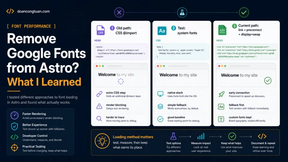
That was exactly what happened during my Astro Lighthouse optimization pass. The site was already static. It was already fast compared with my older WordPress workflow. But it was not perfect. One of the small details was font loading. I was still loading Google Fonts through the wrong path, and for this site, that loading chain was not worth keeping.
Why Google Fonts can affect the render path
A custom web font usually requires at least two steps:
1. Load the font CSS.
2. Load the actual font files.
If you load Google Fonts from an external stylesheet, the browser has to fetch that CSS before it fully knows which font files it needs. If the font is imported inside your CSS like this:
@import url('https://fonts.googleapis.com/css2?family=Inter:wght@400;600;700&display=swap');that can make the critical rendering path less clean. The browser first loads your CSS, then sees the @import, then has to request the Google Fonts CSS, then discovers the font files, then downloads the font files. For a big brand site, maybe that is acceptable. For a small technical content site, I do not love that chain.
The page does not become unusable. But Lighthouse can still notice the extra work. More importantly, I noticed that I was adding complexity for something the reader probably did not care about.
The tradeoff I tested
Removing Google Fonts is a tradeoff. You lose some typographic uniqueness. You gain:
fewer external requests
less dependency on a third-party font service
a simpler render path
less chance of font loading issues
good native rendering on each operating system
For my site, that was a good test. This is not a luxury fashion brand, not a design agency portfolio, not a SaaS landing page where the visual brand is the product. It is a developer content site. The job of the typography is simple:
Make the article readable.
Make code blocks clear.
Make headings easy to scan.
Do not get in the way.
System fonts can do that very well. I still chose to keep custom fonts, but only after changing the loading method. That is the honest version of the story.
The system font stack I tested
Instead of importing Google Fonts, I tested a system font stack. A simplified version looks like this:
body {
  font-family:
    Inter,
    ui-sans-serif,
    system-ui,
    -apple-system,
    BlinkMacSystemFont,
    "Segoe UI",
    sans-serif;
}
You may notice Inter is still first. That does not mean the site loads Inter from Google. It simply means if the user’s system already has Inter installed, the browser can use it. If not, it falls back to the system UI font. A stricter stack would be:
body {
  font-family:
    ui-sans-serif,
    system-ui,
    -apple-system,
    BlinkMacSystemFont,
    "Segoe UI",
    Roboto,
    "Helvetica Neue",
    Arial,
    sans-serif;
}
That is usually enough. On macOS, you get San Francisco. On Windows, you get Segoe UI. On Android, you usually get Roboto. On iOS, you get the native Apple system font. Not exotic, but fast, familiar, and readable.
What I changed
The first thing I removed was the Google Fonts import from global CSS.
Before:
@import url('https://fonts.googleapis.com/css2?family=Inter:wght@400;500;600;700;800&display=swap');After, the font loading moved into the document head:
<link rel="preconnect" href="https://fonts.googleapis.com">
<link rel="preconnect" href="https://fonts.gstatic.com" crossorigin>
<link
  href="https://fonts.googleapis.com/css2?family=DM+Sans:wght@400;500;600;700&display=swap"
  rel="stylesheet"
>
The exact families on this site are IBM Plex Mono, Fraunces, and DM Sans. The code above is shortened so the point is easier to see.
This approach still uses Google Fonts, but the browser sees the font request earlier and the CSS parser is not blocked by an @import chain.
If you decide to remove Google Fonts completely, then you should also remove preconnect hints that are no longer needed:
<link rel="preconnect" href="https://fonts.googleapis.com">
<link rel="preconnect" href="https://fonts.gstatic.com" crossorigin>
The important part is consistency. Do not keep hints for a font strategy you are no longer using.
How I checked the live site
After deploying, I checked what the live page actually sent.
curl -s https://doancongtuan.com/ \
  | grep -Ei "fonts.googleapis|fonts.gstatic|@import|display=swap"
For the current version of the site, I expect to see Google Fonts in the head, not inside a CSS @import.
fonts.googleapis.com
fonts.gstatic.com
display=swap
This is one of my favorite ways to test production changes. Do not only check your source code. Check what the live page actually sends. That is what the browser sees.
Did this alone create a 100 score?
No. And this is important. Font loading was one part of a larger cleanup:
global gzip in Nginx
Google Fonts @import removed
Google Analytics delayed
contrast improved
responsive image workflow added
hero image priority fixed
body images lazy-loaded
old Markdown images converted
The full case study is here:
How I Took My Astro Site from Good to 100 Lighthouse Scores
The image-specific implementation is here:
Astro Image Optimization with Sharp
The font change helped because it simplified the render path. But it was not a magic button. That is usually how performance works. There is rarely one magic fix. There is a sequence of small, boring fixes that remove friction one by one.
When I would keep Google Fonts
I would not remove Google Fonts from every project. There are cases where custom fonts make sense:
A brand site where typography is part of the identity.
A portfolio where visual style matters heavily.
A SaaS homepage where design polish affects conversion.
A client project where brand guidelines require specific fonts.
A multilingual site where font coverage matters.
In those cases, I would not say “never use Google Fonts.” I would say:
Load them deliberately.That means:
Do not use CSS @import.
Use preconnect carefully.
Use font-display.
Limit font weights.
Avoid loading too many families.
Consider self-hosting if you know what you are doing.
The problem is not custom fonts. The problem is casual custom fonts. If a font matters, keep it. If it does not matter, remove it.
When system fonts are enough
System fonts are enough for many sites:
personal blogs
technical blogs
documentation sites
affiliate content sites
review sites
small business content pages
developer portfolios that prioritize speed
The more text-heavy the site is, the more I care about readability and speed over uniqueness. For this site, the font is not the product. The content is. So the font should do its job quietly.
The hidden benefit: fewer things to debug
One thing I like about removing external fonts is simplicity. If you remove them completely, you no longer have to think about:
Google Fonts CSS
font file requests
font preload warnings
preconnect hints
font-display behavior
FOIT
FOUT
unused font weights
font-related render blocking
That is a small mental burden removed. This is the same reason I like Astro for this site, not because Astro makes every decision for me, but because it reduces the number of moving parts. A system font stack is the same kind of decision. Boring, but it removes a whole class of problems.
My practical rule now
My current rule is simple:
If custom typography is part of the brand, keep it and optimize it carefully.
If the site is mainly for reading, start with system fonts.
For a content site, I do not want to pay a performance cost for decoration that most readers will never notice. I would rather spend that budget on better screenshots, clearer diagrams, faster images, stronger content structure, better internal links, cleaner code blocks. That is where the reader feels the difference.
The honest bottom line
Google Fonts are not bad. Custom fonts are not bad. But every external dependency should earn its place.
For doancongtuan.com, the old Google Fonts loading method did not earn its place anymore. The site looked good enough with system fonts in testing. I still kept custom fonts, but only after cleaning up how they load. The render path became simpler, the head became more intentional, and Lighthouse had one less thing to complain about.
That was enough for me. Not every performance win needs to be clever. Sometimes the best optimization is removing something you did not really need.