Before this article, your Astro site has working pages, a layout, and a header. It also looks like a browser default from 1997.
Black text. Blue links. No spacing. No personality.
That changes here.
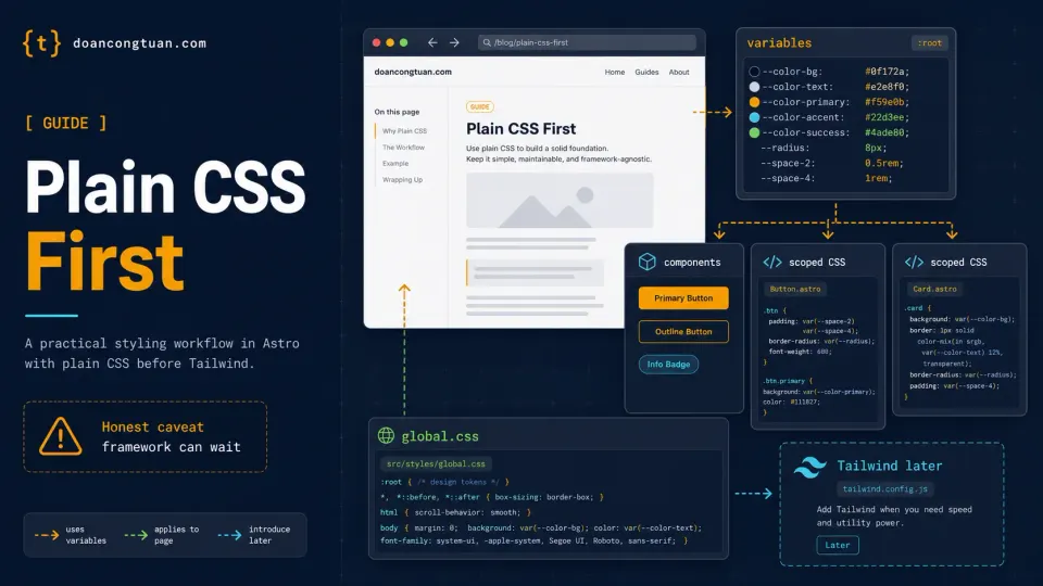
This article covers how CSS works in Astro, builds a styling foundation from scratch, and explains why starting with plain CSS before reaching for Tailwind is worth doing once.
How CSS works in Astro
Astro has two types of CSS. Understanding the difference saves a lot of confusion.
Scoped CSS
Any <style> tag inside an .astro file is scoped: it only affects that component.
<h1>Hello</h1>

<style>
  h1 {
    color: red;
  }
</style>
That h1 { color: red } only applies to the h1 inside this specific component. Write the same rule in ten different components and there are no conflicts. Astro adds a unique attribute to enforce this automatically.
This is different from WordPress, where style.css is global and everything affects everything. In Astro, component styles are isolated by default. You write CSS without worrying about naming collisions.
Global CSS
When you need CSS that applies to the entire site, like base typography, resets, or layout utilities, you create a separate file and import it.
---
import '../styles/global.css'
---
Import it in BaseLayout.astro and every page that uses the layout gets the global styles automatically.
Why start with plain CSS?
Before we write anything, a fair question: why not just use Tailwind from the start?
Because plain CSS makes you understand what’s happening. When you write display: flex; justify-content: space-between, you know exactly what that does. When you write flex justify-between in Tailwind, you’re trusting that you know what those classes do.
The next article covers Tailwind in detail, including when and why to switch. For now, build the foundation in CSS you can read and understand.
And honestly? Looking at the result might surprise you.
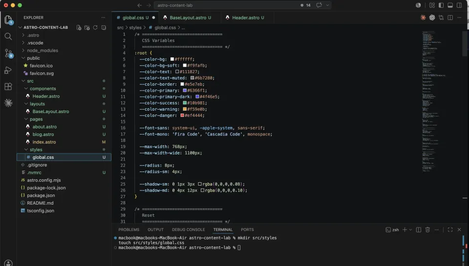
Step 1: Create global.css
Create the styles folder and file:
mkdir src/styles
touch src/styles/global.css
Open src/styles/global.css and add the complete foundation:
/* ================================
   CSS Variables
   ================================ */
:root {
  --color-bg: #ffffff;
  --color-bg-soft: #f9fafb;
  --color-text: #111827;
  --color-text-muted: #6b7280;
  --color-border: #e5e7eb;
  --color-primary: #6366f1;
  --color-primary-dark: #4f46e5;
  --color-success: #10b981;
  --color-warning: #f59e0b;
  --color-danger: #ef4444;

  --font-sans: system-ui, -apple-system, sans-serif;
  --font-mono: 'Fira Code', 'Cascadia Code', monospace;

  --max-width: 768px;
  --max-width-wide: 1100px;

  --radius: 8px;
  --radius-sm: 4px;

  --shadow-sm: 0 1px 3px rgba(0,0,0,0.08);
  --shadow-md: 0 4px 12px rgba(0,0,0,0.10);
}

/* ================================
   Reset
   ================================ */
*, *::before, *::after {
  box-sizing: border-box;
  margin: 0;
  padding: 0;
}

/* ================================
   Base
   ================================ */
html {
  font-size: 16px;
  scroll-behavior: smooth;
}

body {
  font-family: var(--font-sans);
  color: var(--color-text);
  background: var(--color-bg);
  line-height: 1.7;
  -webkit-font-smoothing: antialiased;
}

/* ================================
   Typography
   ================================ */
h1, h2, h3, h4, h5, h6 {
  line-height: 1.3;
  font-weight: 700;
  color: var(--color-text);
}

h1 { font-size: 2rem; margin-bottom: 1rem; }
h2 { font-size: 1.5rem; margin-bottom: 0.75rem; margin-top: 2rem; }
h3 { font-size: 1.25rem; margin-bottom: 0.5rem; margin-top: 1.5rem; }

p {
  margin-bottom: 1.25rem;
  color: var(--color-text);
}

a {
  color: var(--color-primary);
  text-decoration: none;
}

a:hover {
  color: var(--color-primary-dark);
  text-decoration: underline;
}

ul, ol {
  padding-left: 1.5rem;
  margin-bottom: 1.25rem;
}

li {
  margin-bottom: 0.4rem;
}

code {
  font-family: var(--font-mono);
  font-size: 0.875rem;
  background: var(--color-bg-soft);
  border: 1px solid var(--color-border);
  padding: 0.15rem 0.4rem;
  border-radius: var(--radius-sm);
}

pre {
  background: #1e1e2e;
  color: #cdd6f4;
  padding: 1.25rem;
  border-radius: var(--radius);
  overflow-x: auto;
  margin-bottom: 1.5rem;
  font-size: 0.875rem;
  line-height: 1.6;
}

pre code {
  background: none;
  border: none;
  padding: 0;
  color: inherit;
}

blockquote {
  border-left: 4px solid var(--color-primary);
  padding: 0.75rem 1.25rem;
  margin: 1.5rem 0;
  background: var(--color-bg-soft);
  border-radius: 0 var(--radius) var(--radius) 0;
  color: var(--color-text-muted);
  font-style: italic;
}

img {
  max-width: 100%;
  height: auto;
  border-radius: var(--radius);
}

hr {
  border: none;
  border-top: 1px solid var(--color-border);
  margin: 2rem 0;
}

/* ================================
   Tables
   ================================ */
table {
  width: 100%;
  border-collapse: collapse;
  margin-bottom: 1.5rem;
  font-size: 0.9375rem;
}

thead {
  background: var(--color-bg-soft);
}

th {
  text-align: left;
  padding: 0.75rem 1rem;
  font-weight: 600;
  border-bottom: 2px solid var(--color-border);
}

td {
  padding: 0.75rem 1rem;
  border-bottom: 1px solid var(--color-border);
}

tr:last-child td {
  border-bottom: none;
}

tr:hover td {
  background: var(--color-bg-soft);
}

/* ================================
   Layout
   ================================ */
.container {
  max-width: var(--max-width);
  margin: 0 auto;
  padding: 0 1.25rem;
}

.container-wide {
  max-width: var(--max-width-wide);
  margin: 0 auto;
  padding: 0 1.25rem;
}

main {
  padding: 2.5rem 0;
  min-height: calc(100vh - 200px);
}

/* ================================
   Responsive
   ================================ */
@media (max-width: 640px) {
  h1 { font-size: 1.625rem; }
  h2 { font-size: 1.25rem; }

  main {
    padding: 1.5rem 0;
  }
}
Understanding CSS variables
The :root block at the top defines CSS variables, also called custom properties.
:root {
  --color-primary: #6366f1;
}
Use them anywhere with var():
a {
  color: var(--color-primary);
}

.btn {
  background: var(--color-primary);
}
Why does this matter? Because your entire color scheme is now defined in one place. Want to change your brand color from indigo to green? Change one line in :root. Every rule that uses var(--color-primary) updates automatically.
Without variables, you’d be doing a find-and-replace across hundreds of CSS rules.
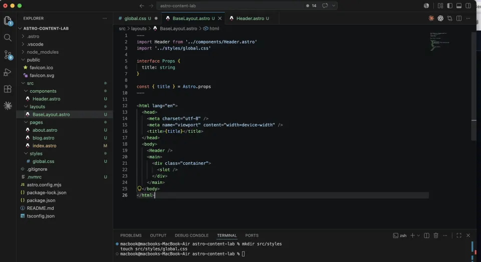
Step 2: Import global CSS into BaseLayout
Open src/layouts/BaseLayout.astro and add the import:
---
import Header from '../components/Header.astro'
import '../styles/global.css'

interface Props {
  title: string
}

const { title } = Astro.props
---

<html lang="en">
  <head>
    <meta charset="utf-8" />
    <meta name="viewport" content="width=device-width" />
    <title>{title}</title>
  </head>
  <body>
    <Header />
    <main>
      <div class="container">
        <slot />
      </div>
    </main>
  </body>
</html>
Two changes: the global CSS import at the top, and a <main> tag with .container around the slot. The .container class limits content width to 768px and centers it, defined in global.css.
Save and check localhost:4321. The typography should already look significantly better.
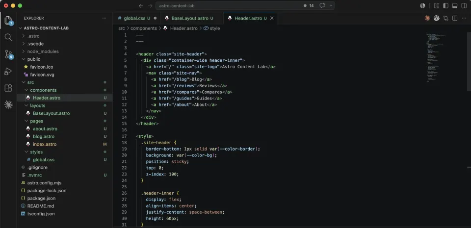
Step 3: Style the Header
The current Header is unstyled nav links. Replace src/components/Header.astro with:
---
---

<header class="site-header">
  <div class="container-wide header-inner">
    <a href="/" class="site-logo">Astro Content Lab</a>
    <nav class="site-nav">
      <a href="/blog">Blog</a>
      <a href="/reviews">Reviews</a>
      <a href="/compares">Compares</a>
      <a href="/guides">Guides</a>
      <a href="/about">About</a>
    </nav>
  </div>
</header>

<style>
  .site-header {
    border-bottom: 1px solid var(--color-border);
    background: var(--color-bg);
    position: sticky;
    top: 0;
    z-index: 100;
  }

  .header-inner {
    display: flex;
    align-items: center;
    justify-content: space-between;
    height: 60px;
  }

  .site-logo {
    font-weight: 700;
    font-size: 1.125rem;
    color: var(--color-text);
    text-decoration: none;
  }

  .site-logo:hover {
    color: var(--color-primary);
  }

  .site-nav {
    display: flex;
    gap: 1.5rem;
  }

  .site-nav a {
    color: var(--color-text-muted);
    font-size: 0.9375rem;
    font-weight: 500;
    text-decoration: none;
    transition: color 0.2s;
  }

  .site-nav a:hover {
    color: var(--color-primary);
    text-decoration: none;
  }

  @media (max-width: 640px) {
    .site-nav {
      gap: 1rem;
    }

    .site-nav a {
      font-size: 0.875rem;
    }
  }
</style>
Notice the <style> tag at the bottom: this is scoped CSS. The .site-header and .site-nav classes only apply inside this component. You could use the same class names elsewhere without conflict.
The header also uses var(--color-border), var(--color-text), var(--color-primary), values defined in global.css. This is how variables keep everything consistent.
Step 4: Add a Footer
Create src/components/Footer.astro:
---
const year = new Date().getFullYear()
---

<footer class="site-footer">
  <div class="container-wide footer-inner">
    <p class="footer-copy">© {year} Astro Content Lab. Built with Astro.</p>
    <nav class="footer-nav">
      <a href="/blog">Blog</a>
      <a href="/reviews">Reviews</a>
      <a href="/compares">Compares</a>
      <a href="/guides">Guides</a>
      <a href="/about">About</a>
    </nav>
  </div>
</footer>

<style>
  .site-footer {
    border-top: 1px solid var(--color-border);
    background: var(--color-bg-soft);
    padding: 2rem 0;
    margin-top: 4rem;
  }

  .footer-inner {
    display: flex;
    align-items: center;
    justify-content: space-between;
    flex-wrap: wrap;
    gap: 1rem;
  }

  .footer-copy {
    color: var(--color-text-muted);
    font-size: 0.875rem;
    margin: 0;
  }

  .footer-nav {
    display: flex;
    gap: 1.25rem;
  }

  .footer-nav a {
    color: var(--color-text-muted);
    font-size: 0.875rem;
    text-decoration: none;
  }

  .footer-nav a:hover {
    color: var(--color-primary);
  }

  @media (max-width: 640px) {
    .footer-inner {
      flex-direction: column;
      align-items: flex-start;
    }
  }
</style>
Two small details matter here:
const year = new Date().getFullYear() is JavaScript in the frontmatter. It runs at build time and puts the current year in the footer. No plugin needed. No manual updating every January.
{year} in the template renders that value as HTML.
Add Footer to BaseLayout.astro:
---
import Header from '../components/Header.astro'
import Footer from '../components/Footer.astro'
import '../styles/global.css'

interface Props {
  title: string
}

const { title } = Astro.props
---

<html lang="en">
  <head>
    <meta charset="utf-8" />
    <meta name="viewport" content="width=device-width" />
    <title>{title}</title>
  </head>
  <body>
    <Header />
    <main>
      <div class="container">
        <slot />
      </div>
    </main>
    <Footer />
  </body>
</html>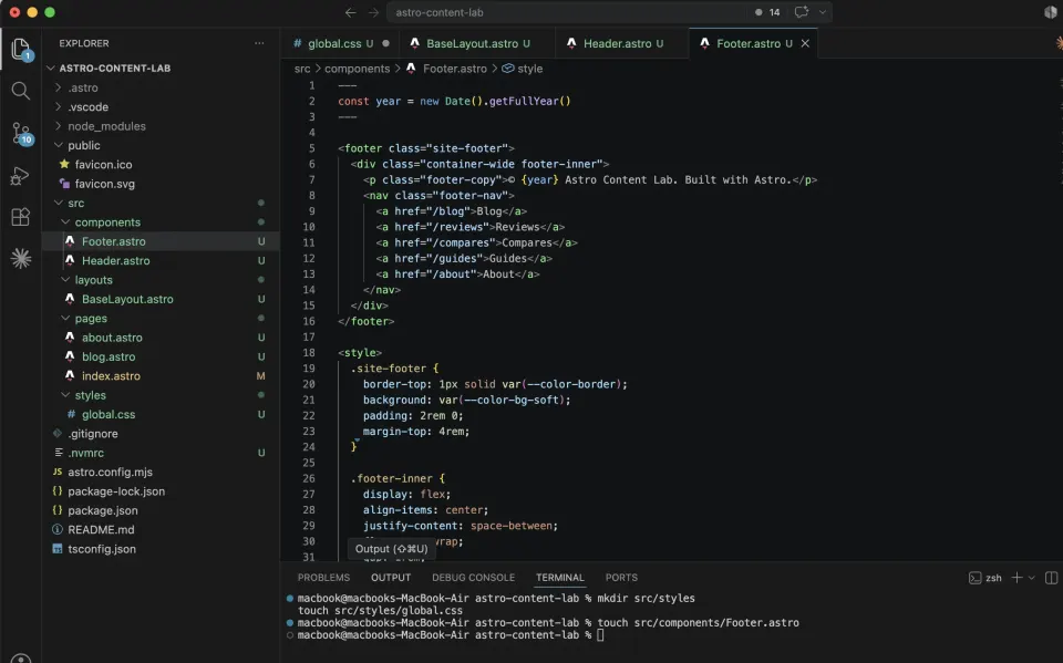
Step 5: Style the home page
Replace src/pages/index.astro with a proper home page:
For now, the post and review cards use temporary arrays inside the page. Later in the series, you will replace those placeholders with real Markdown/MDX content and Content Collections.
---
import BaseLayout from '../layouts/BaseLayout.astro'

const latestPosts = [
  {
    slug: 'hello-world',
    title: 'Hello Astro',
    description: 'The first post in the demo project.'
  },
  {
    slug: 'what-is-static-site',
    title: 'What is a Static Site?',
    description: 'A beginner-friendly explanation of pre-built HTML.'
  },
  {
    slug: 'wordpress-to-astro',
    title: 'From WordPress to Astro',
    description: 'Notes from moving a content workflow into Astro.'
  }
]

const latestReviews = [
  {
    slug: 'hostinger-review',
    title: 'Hostinger Review',
    description: 'A beginner hosting review placeholder for the demo site.',
    rating: 4
  },
  {
    slug: 'astro-review',
    title: 'Astro Review',
    description: 'A quick review-style card used for layout testing.',
    rating: 5
  }
]
---

<BaseLayout title="Astro Content Lab — Learn Astro from Scratch">

  <section class="hero">
    <h1>Learn Astro by Building a Real Content Site</h1>
    <p class="hero-desc">A hands-on series for WordPress users and beginners who want to understand modern web development — from static site to mini CMS.</p>
    <div class="hero-actions">
      <a href="/blog" class="btn btn-primary">Read the Blog</a>
      <a href="https://github.com/doancongtuan/astro-content-lab" class="btn btn-outline" target="_blank">View on GitHub</a>
    </div>
  </section>

  <section class="section">
    <div class="section-header">
      <h2>Latest Posts</h2>
      <a href="/blog" class="see-all">See all →</a>
    </div>
    <div class="card-grid">
      {latestPosts.map((post) => (
        <a href={`/blog/${post.slug}`} class="card">
          <div class="card-body">
            <h3>{post.title}</h3>
            <p>{post.description}</p>
          </div>
          <span class="card-link">Read more →</span>
        </a>
      ))}
    </div>
  </section>

  <section class="section">
    <div class="section-header">
      <h2>Latest Reviews</h2>
      <a href="/reviews" class="see-all">See all →</a>
    </div>
    <div class="card-grid">
      {latestReviews.map((review) => (
        <a href={`/reviews/${review.slug}`} class="card">
          <div class="card-body">
            <span class="badge">Review</span>
            <h3>{review.title}</h3>
            <p>{review.description}</p>
            <p class="rating">{'★'.repeat(Math.floor(review.rating))}{'☆'.repeat(5 - Math.floor(review.rating))} {review.rating}/5</p>
          </div>
          <span class="card-link">Read review →</span>
        </a>
      ))}
    </div>
  </section>

  <section class="section about-section">
    <h2>What is Astro Content Lab?</h2>
    <p>This is the demo project for the series <strong>"Learn Astro from Scratch"</strong> — a practical guide for WordPress users who want to understand how modern static sites work.</p>
    <p>Every page on this site was built step by step, documented in the series. The source code is public on GitHub.</p>
    <a href="/about" class="btn btn-outline">About this project →</a>
  </section>

</BaseLayout>

<style>
  .hero {
    padding: 4rem 0 3rem;
    text-align: center;
    border-bottom: 1px solid var(--color-border);
    margin-bottom: 3rem;
  }

  .hero h1 {
    font-size: 2.25rem;
    max-width: 600px;
    margin: 0 auto 1rem;
  }

  .hero-desc {
    color: var(--color-text-muted);
    font-size: 1.125rem;
    max-width: 520px;
    margin: 0 auto 2rem;
  }

  .hero-actions {
    display: flex;
    gap: 1rem;
    justify-content: center;
    flex-wrap: wrap;
  }

  .btn {
    display: inline-block;
    padding: 0.625rem 1.375rem;
    border-radius: var(--radius);
    font-weight: 600;
    font-size: 0.9375rem;
    text-decoration: none;
    transition: all 0.2s;
  }

  .btn-primary {
    background: var(--color-primary);
    color: #fff;
  }

  .btn-primary:hover {
    background: var(--color-primary-dark);
    text-decoration: none;
    color: #fff;
  }

  .btn-outline {
    border: 1.5px solid var(--color-border);
    color: var(--color-text);
  }

  .btn-outline:hover {
    border-color: var(--color-primary);
    color: var(--color-primary);
    text-decoration: none;
  }

  .section {
    margin-bottom: 3.5rem;
  }

  .section-header {
    display: flex;
    align-items: center;
    justify-content: space-between;
    margin-bottom: 1.5rem;
  }

  .section-header h2 {
    margin: 0;
  }

  .see-all {
    font-size: 0.9rem;
    color: var(--color-primary);
    text-decoration: none;
    font-weight: 500;
  }

  .card-grid {
    display: grid;
    grid-template-columns: repeat(auto-fill, minmax(280px, 1fr));
    gap: 1.25rem;
  }

  .card {
    display: flex;
    flex-direction: column;
    justify-content: space-between;
    border: 1px solid var(--color-border);
    border-radius: var(--radius);
    padding: 1.25rem;
    text-decoration: none;
    color: var(--color-text);
    background: var(--color-bg);
    transition: all 0.2s;
  }

  .card:hover {
    border-color: var(--color-primary);
    box-shadow: var(--shadow-md);
    text-decoration: none;
    transform: translateY(-2px);
  }

  .card-body h3 {
    font-size: 1rem;
    margin: 0.5rem 0 0.5rem;
  }

  .card-body p {
    font-size: 0.875rem;
    color: var(--color-text-muted);
    margin: 0;
  }

  .card-link {
    font-size: 0.875rem;
    color: var(--color-primary);
    font-weight: 500;
    margin-top: 1rem;
    display: block;
  }

  .badge {
    display: inline-block;
    font-size: 0.75rem;
    font-weight: 600;
    padding: 0.2rem 0.6rem;
    border-radius: 999px;
    background: #ede9fe;
    color: #7c3aed;
  }

  .rating {
    color: var(--color-warning);
    font-size: 0.875rem;
    margin-top: 0.5rem !important;
  }

  .about-section {
    background: var(--color-bg-soft);
    border: 1px solid var(--color-border);
    border-radius: var(--radius);
    padding: 2rem;
  }

  .about-section h2 {
    margin-top: 0;
  }

  @media (max-width: 640px) {
    .hero {
      padding: 2.5rem 0 2rem;
    }

    .hero h1 {
      font-size: 1.625rem;
    }

    .card-grid {
      grid-template-columns: 1fr;
    }
  }
</style>
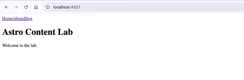
The result
After all these changes, your site should look like this:
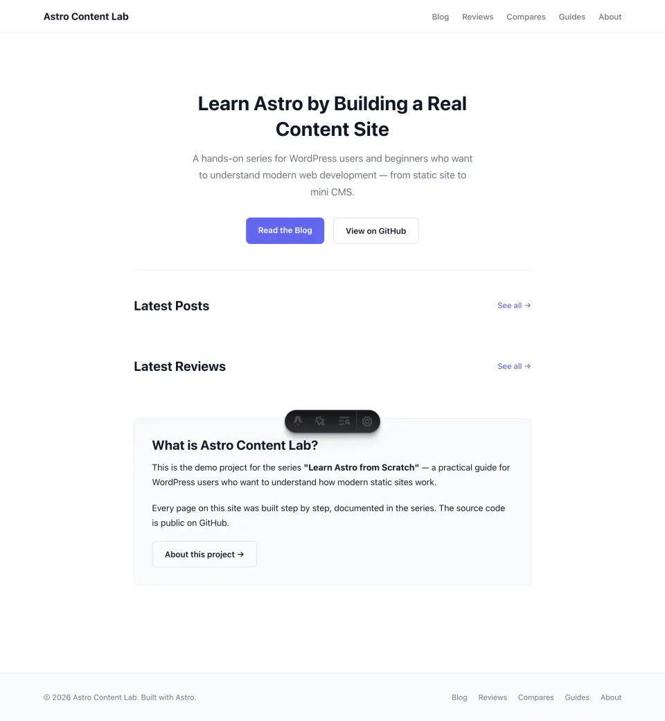
Completed demo for this lesson:
This lesson gives the site its visual foundation. In later parts of the series, you will see how to add more content types, including blog posts, reviews, comparisons, and guides, without rebuilding the whole structure from scratch.
Scoped vs global: when to use which
The question comes up: should I put this CSS in the component’s <style> tag or in global.css?
Use scoped CSS (component <style> tag) for:
- Styles that only apply to one specific component
- Layout and appearance of the component itself
- Hover states, transitions, local variants
Use global CSS for:
- CSS reset and base browser normalization
- Typography defaults (body font, heading sizes)
- CSS variables in
:root - Layout utilities like
.container - Table styles, code block styles
The reason to keep CSS in the component rather than global.css: it’s easier to find and edit later. Want to change how the Header looks? Open Header.astro. The CSS is right there. You don’t have to scroll through a 500-line global.css hunting for .site-header.
What’s next: Tailwind
This CSS foundation works well for a content site. But as the project grows, with more components, more variants, more responsive adjustments, plain CSS gets verbose.
The next article covers switching to Tailwind CSS: what it is, why it helps, how to install it in Astro, and how to migrate from plain CSS to utility classes.
The short version: Tailwind doesn’t replace the concepts in this article. It replaces the syntax.